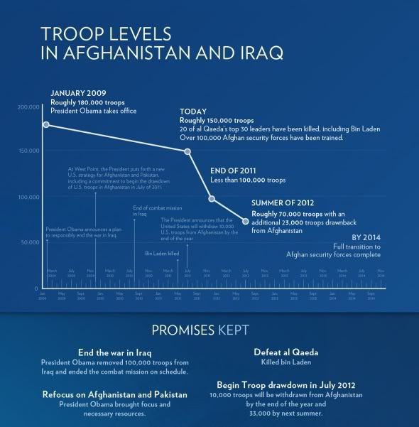
And then today, this one comes to us from The White House Blog via Blackwaterdog.

People can use whichever one backs up the story they're trying to tell.


During an appearance on the Shawn Ryan Show, Cenk Uygur said something monumentally stupid. And of course, the right wing site RealClearPoli...

Great visual! Did blackwaterdog create the second chart? If not, do you know the source?
ReplyDeleteI had been looking for the source and just found it - the whitehouse.gov blog. I'll post a link in the diary.
ReplyDelete