Thursday, March 3, 2016

Why the Democratic Coalition Matters: In Charts

The current presidential primary is inspiring a discussion about the Democratic coalition. This is an important conversation to have. To demonstrate, I'm going to share three charts with you. The first two were created by BuzzFeed right after the 2012 presidential election. This one shows what the electoral map would have looked like if only men had voted.


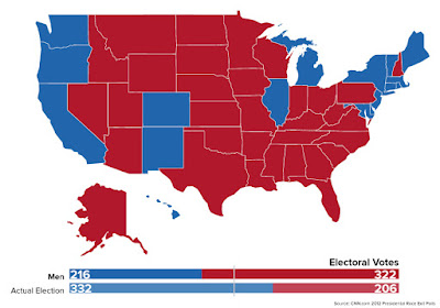
It gets even worse if only white people had voted.


Finally, the third one comes from the 2008 presidential election and flips the script to ask what would have happened if only 18-29 year olds had voted.


That one should terrify Republicans.

But the message overall is that we need this coalition to succeed. That is why listening to each other about our differences and finding our common ground is so critical.

No comments:

Post a Comment

"I'd much rather be us than them"

According to the polling aggregate at The Economist, if the 2024 presidential election were held today, it would result in a tie. There'...